Ever since the Square IPO, I’ve been keeping a closer eye on, while trying to learn more about, the US stock market. Even though my first job out of school involved supporting systems that aggregated financial data across stock exchanges, it was a job that consisted of building systems on a purely technical level, without understanding or appreciating the art behind the utility. At its core, the process of aggregating said data consisted mostly of collecting and processing a series of ticker symbols, prices, and timestamps.
On places like the Boglehead forums, the main piece of advice is to keep stock market investments simple and diversified, and avoid the temptation of trying to “beat the market” by making unnecessary, albeit exciting, gambles. If you are to bet on an individual stock or three, the way to do it is by understanding its fundamental business, project out future earnings and growth, and invest for the long run1. It’s a boring but steady way to compound returns to accumulate wealth, known by stock market investors as fundamental analysis.
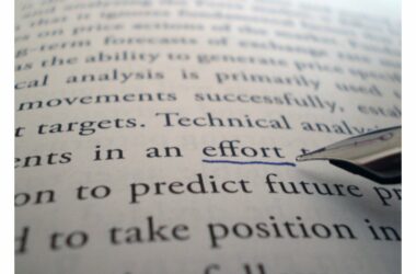
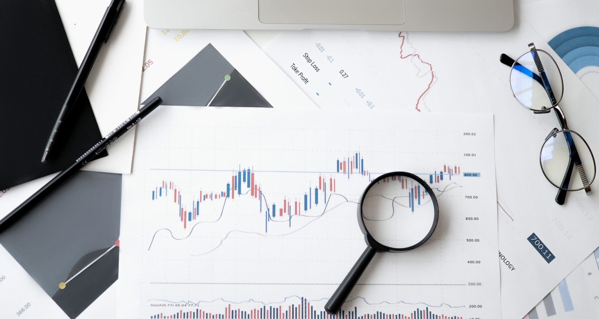
More recently—tracking now the ebbs and flows of $AFRM after its IPO—I became interested in understanding yin to fundamental analysis’s yang, generally referred to as technical analysis. I quickly read through a book called Charting and Technical Analysis, and true to its name, the author talks primarily about analyzing stocks based on their trading histories, looking for patterns and trends in its price movements to predict where the price will be going and thus how and when to start and exit investment positions. As those prices are represented visually via industry-standard candle charts, this field has developed an entire nomenclature around stock price phenomenon, based mostly on what shapes of the graphs kinda, sorta looks like. It reminds me a bit of constellations, in that the patterns take healthy heaps of imagination to come up with a set of colorful names; instead of bears and archers, we have shooting stars and black birds.
The fundamental assumption is that a stock’s price captures all of its possible information, an expression of the efficient markets hypothesis, encompassing all of the important business parameters used in fundamental analysis in addition to qualifiable aspects like public and private information, rumors, news, even confusing ticker names. First advanced by Charles Dow, the framework is known as the Dow Theory, initially applied to transportation but now forms the foundation of technical analysis. Despite every advisor’s disclaimer that past performance is not indicative of future returns, it sure seems like that’s one way to inform stock trades…in the future.
I’m personally not all that convinced of the lofty predictions derived from this kind of technical analysis. For one, humans are hard-wired to see patterns regardless of their existence, and every technical analyst I watch on YouTube seems to have their slightly different take on a stock based on selective timeframes, somewhat arbitrary lines drawn between points on the chart, culminating in price predictions which are often hedged 2. A lot of the patterns are just general enough that they can fit multiple circumstances, so explanations tend to sound astrological: there’s already a conclusion, the technical data is selectively included as proof, but it’s all vague enough to allow for plausible deniability.
There’s also little to no explanation as to why these patterns foretell how a stock performs in the near future. In that, this sort of analysis reminds me of quantum mechanics, in that both rely on a series of repeated, in-depth observations which in all instances acts causally, but lack a logical framework that ties all the rules together. With physics, the field recognizes this deficiency, and has been searching for a Grand Unified Theory that can tie all of its disparate observations into a singular model; I’m not sure the the same zeal exists within the technical analysis community.
But! The funny thing about markets is that their behaviors are driven by their participants, so if you get enough people to behave a certain way, then by definition the market will start exhibiting those behaviors. This is how our current state of meme finance has come about—enough retail investors jump onto meme stocks and securities, developing strategies which would be nonsensical individually but redefine the markets at sufficient scale, which then creates this flywheel effect where others see the meme stock spike and also jump causing these acute feedback loops. Once enough people starting trading in accordance to Dow’s original theory, it may have well become a self-fulfilling prophecy.
Time in market over timing the market, so the saying goes.↩
E.g., the charts say it should go to the moon 🚀, but it can also fall below support too.↩