paid app.
And yet, I’ve tried a lot of them, from the one that plays zen music in the background (Ommwriter), to the one that got a little too obsessed about the font (iA Writer). There are a bunch more that, as far as I can tell, differentiate themselves mostly by having their own one-off features optimized for some subset of writers (Byword, Focused, Write). And of course, there’s nothing wrong with using any number of notes apps, Office-type word processors, code editors, or just plain old TextEdit/Notepad.
So why try out Typora?
On the features front, it’s pretty barebones: its main feature is rendering inline Markdown as you type out the various syntax formatting symbols. It doesn’t have anything around syncing to mobile apps, publishing to blogs, file management, writing process and flow management, or even metadata beyond a single word count. Granted, the Markdown rendering is pretty advanced, but the complex formula and table rendering is fairly niche.
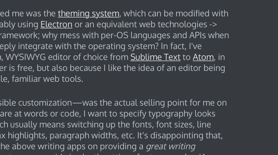
Rather, what interested me was the theming system, which can be modified with simple CSS. It’s probably using Electron or an equivalent web technologies -> native desktop app framework; why mess with per-OS languages and APIs when you don’t need to deeply integrate with the operating system? In fact, I’ve replaced my non-vim, WYSIWYG editor of choice from Sublime Text to Atom, in part because the latter is free, but also because I like the idea of an editor being modifiable with simple, familiar web tools.
That feature—accessible customization—was the actual selling point for me on Typora. If I have to stare at words or code, I want to specify typography looks right to my eyes, which usually means switching up the fonts, font sizes, line heights, colors, syntax highlights, paragraph widths, etc. It’s disappointing that, for all marketing by the above writing apps on providing a great writing experience, they almost never provide in-depth settings for typography. iA Writer is especially overbearing, enforcing a single font and automatic font sizes because that’s what the app developers have determined to be optimal.
CSS turns out to be an easy way to set, well, the styling of a document. Using selectors to target UI elements is straight forward, and two decades of work of iterating on CSS rulesets and rendering engines have done a good job in refining how they’ll look1. For all the shade thrown at front-end web development over the years, the main architectural components and languages have persisted to this day, and have been battle-tested in such a variety of user interfaces that I expect it to fare just as well, if not better than any native UI system.
In any case, I couldn’t help but tweak my own Typora theme. I called it dusk, and based it off of the default dark theme. If you decide to check out Typora2, give it a look.


